The Flat Little Envoy: What Happens When a Painting Goes Through a Lens
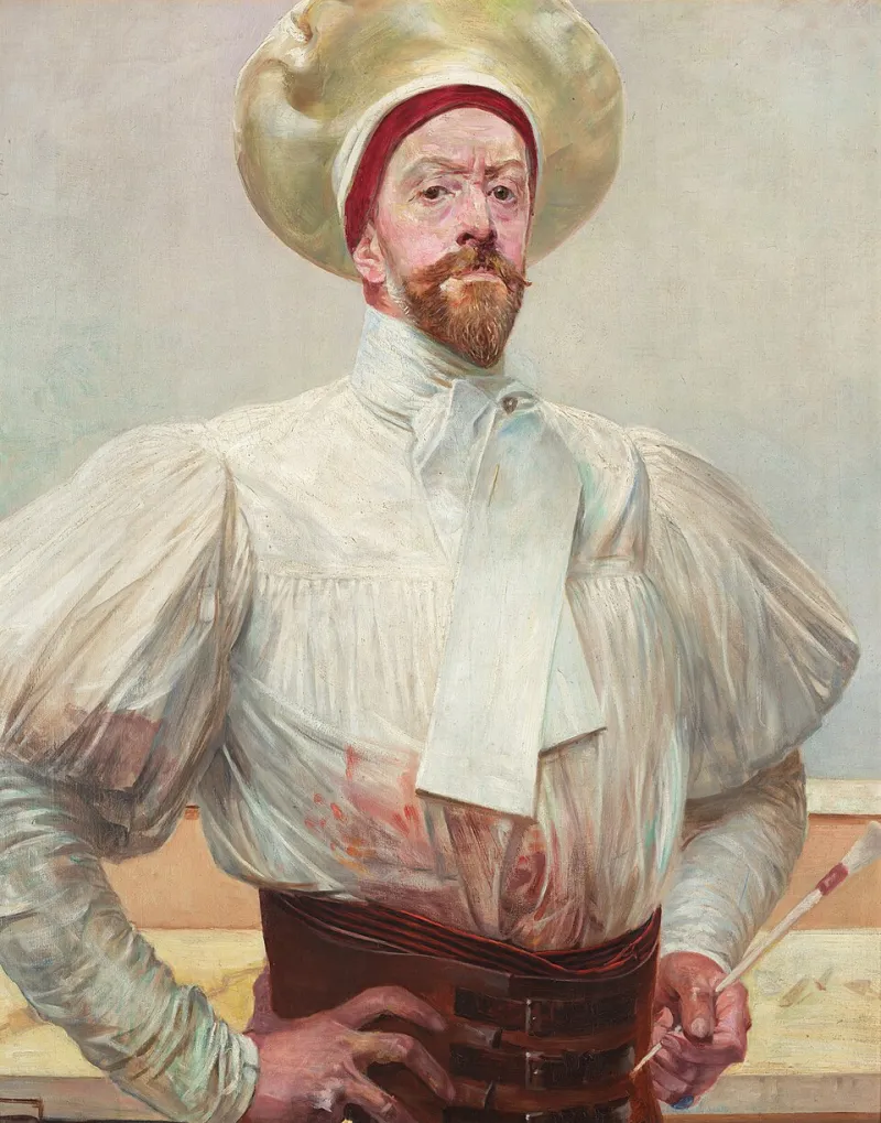
Photo: Jacek Malczewski, Public domain, via Wikimedia Commons
Every painting I finish eventually gets flattened. Not physically — the canvas keeps its bump and its weave — but digitally it becomes a rectangle of pixels small enough to travel down a cable and land in your inbox before the kettle boils. I have sent hundreds of these flat little envoys out into the world, and I have learned to distrust them in a friendly sort of way.
The camera doesn't lie, it flatters
A camera is not a neutral witness. Point one at a canvas and it immediately starts making decisions: where the light falls, which shadows it lifts, how much contrast it thinks you can handle. Set it to auto and it will often produce something brighter and cleaner than the painting in front of me — a version with the volume turned up. Blues go electric. Warm whites go creamy. A subtle grey-green that took me three weeks to mix arrives on screen looking like a mint leaf.
That is not dishonesty, exactly. It is translation. But collectors should know that the file they are admiring is a translation with a strong accent.
Colour, calibrated and otherwise
The technical side is worth a paragraph, because it explains why two people can look at the same JPEG and see two different paintings. I photograph work in RAW where I can, under a mix of daylight and a soft diffused lamp, with a grey card in the first frame. That card gives me a reference point when I process the file — a known neutral that tells me whether the whites have drifted warm or the shadows have gone blue. Then I convert to sRGB, because that is the colour space most screens understand without throwing a tantrum.
Even so, your screen has opinions. A laptop set to 'vivid' will push saturation until a muted ochre starts shouting. A phone in night mode will warm everything towards candlelight. A monitor that has never been calibrated — which is most of them — may be showing you a painting I would barely recognise. None of this is anyone's fault. It is just the gap between a physical object and a glowing grid.
Brightness is a mood, not a measurement
Here is a small experiment. Open a painting you love on your phone. Now turn the brightness down by a third. Then up by a third. The painting has not changed, but its mood has. At low brightness the darks close in and the whole thing feels more serious. At high brightness the surface opens up and every pale passage starts to glow.
I have had collectors tell me a painting was 'much darker in real life' and others say it was 'lighter and airier'. Both are true, depending on the screen and the room. A February afternoon in a north-facing studio is not the same as a July evening with the curtains open. British light is its own character in this story — soft, changeable, often grey in a way that makes warm colours look warmer. A JPEG cannot carry any of that weather with it.
How to read a photograph honestly
You can still learn a great deal from an online image. You just have to ask it the right questions. Look at more than one photograph if they exist — a full view, a detail, maybe a shot of the work on a wall. Ask for a phone snap taken in ordinary daylight; those are often more truthful than the polished studio file. Check whether the image shows the edges of the canvas or crops them away. Ask about scale using something familiar: 'Is the hare's ear roughly the length of a teaspoon?' works better than a number of centimetres that means nothing until you are standing in front of it.
If you are buying, it is fair to ask for a short video, taken slowly, with the light coming across the surface. Raking light reveals texture — the ridge of a brushstroke, the tooth of the canvas, the places where the paint sits thin. That texture is half the painting, and it is exactly what a flat JPEG cannot show you.
Why the trip is still worth it
I am not arguing against photographs. They are how most people first meet my work, and I am grateful for every one of those introductions. But a photograph is a summary, and a painting is an argument you have to stand inside. In person you get the scale against your own body, the way the surface changes as you move, the small imperfections that make a made thing feel made. You get the colour without the screen's interference. You get the thing itself.
So use the JPEG as an invitation, not a verdict. Let it tell you whether the painting interests you. Then, if you can, go and meet it properly — in a gallery, in a studio, in a village hall on a wet Saturday. The flat little envoy has done its job once it has got you through the door.