A Sky Full of Greys: Choosing Colour in a British Studio
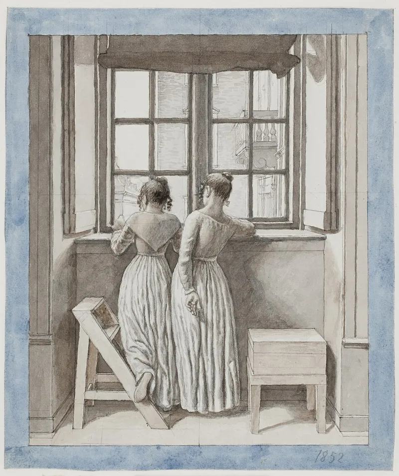
Photo: Christoffer Wilhelm Eckersberg, Public domain, via Wikimedia Commons
British daylight is not a single thing. It is a grey that leans blue before rain, a white that turns peach at four o’clock in November, a summer glare that makes the studio feel like a different room. Painting here means accepting that the light is a collaborator with a short attention span. The palette has to work through all of it.
The window is the first tool
Before I choose a brush, I look at the sky. On a bright day the studio feels generous; on an overcast day it goes quiet and slightly cool. That is not a problem to be fixed with more lamps. It is information.
I mix differently depending on what the window is doing. On grey days I reach for warm whites and muted greens. A cold white can look chalky against a British sky; a white with a little warmth in it holds its place. The greens in the landscape outside my window are rarely postcard green. They are olive, sage, moss, the colour of a hedge after rain. Those are the greens I want in the paintings, not a bright synthetic green that only makes sense on a screen.
Why warm whites hold their own
A warm white is not a trick or a filter. It is a decision about how the surface will behave when the light is less than ideal. I often start with an off-white ground, or mix titanium white with a touch of ochre or a whisper of warm grey. Under cool northern light, that warmth keeps the painting from going dead.
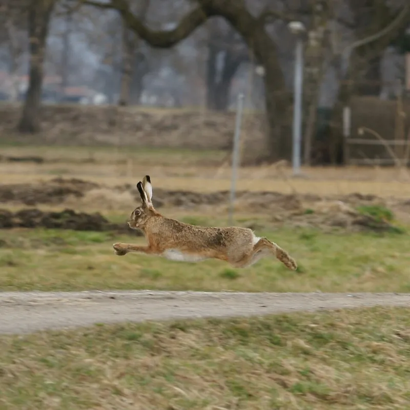
The same applies to greens. A pure green can glare on an overcast day. A green mixed with yellow ochre and a little red feels more like the actual world — softer, more complicated, easier to live with. In hare paintings, that matters. The animal is not sitting in a laboratory. It is sitting in a field, or at the edge of one, under a sky that cannot make up its mind.
The test board and the three-light check
I keep a test board in the studio: patches of colour, sometimes whole small studies, pinned up near the window. I look at them in the morning, in the afternoon and under a lamp at night. If a colour only works in one of those situations, it is not finished.
The three-light check is simple. First, the studio window — usually the most honest light, even when it is grey. Second, a gallery-style spotlight, which tends to be cooler and more directional. Third, a domestic lamp, which is warmer and softer and can make greens turn khaki. A painting has to survive all three.
That is why I do not trust a single photograph of a finished work. A camera can flatten a warm white into something icy, or turn a muted green into a flat olive. The painting is an object. It needs to be seen as one.
The painting that changes at four o’clock
There is a painting in the studio that I thought was finished at noon. By four, the white in the sky had gone slightly grey and the whole thing felt cooler. Nothing had changed except the weather. That is not a fault in the painting. It is the painting doing what paintings do: sitting in a room and responding to the light.
Collectors often tell me a work looks different at home. Of course it does. A gallery has spotlights and high ceilings; a living room has a window, a lampshade and a wall that may be warmer or cooler than expected. The surprise is not a sign that you bought the wrong thing. It is a sign that you have bought an object rather than an image.
What collectors can learn from viewing at different times
Do not judge a painting on one visit. If you are looking in a gallery, ask to see it away from the brightest spot on the wall, or ask for a daylight photograph. If you are living with a new piece, give it a week before you decide how you feel. Look at it with your morning coffee and again with the lamp on. Move it if the wall is fighting it.
Avoid hanging a painting opposite a window if you can, and keep it out of direct sun. A picture light can be lovely, but it changes the colour temperature; use it because you like the effect, not because you think the painting needs rescuing.
Letting the weather in
A painting made under British skies is never quite one colour. It is a warm white that turns creamy in the evening, a green that goes quieter before rain, a grey that leans blue at the edge of the day. I like that. It means the work is not a fixed screen. It is a surface in a room, doing its job while the weather gets on with its own.
Grey skies do not make a dull palette. They make a palette that has to be chosen carefully. Warm whites, muted greens and a willingness to check the work under more than one light — that is most of the argument, really.