The Quiet Card: Making Wall Labels That Let Paintings Breathe
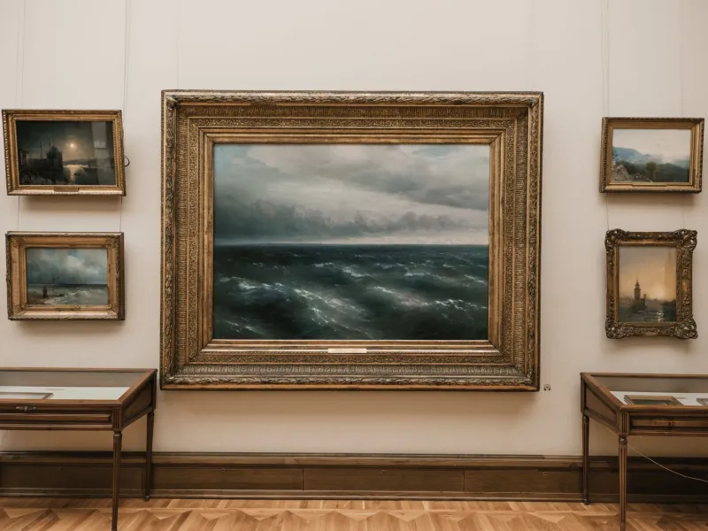
A good wall label is a bit like a good host at a private view: it says hello, gives you what you need, and then gets out of the way. At Kay Hare Art, that balance matters. The paintings are full of colour, weather, hare imagery and studio decisions, and it is tempting to explain every one of them on a neat white card. But a label is not the painting. It is a small piece of furniture beside it, and its job is to help someone stay a little longer.
Start with the painting, not the paragraph
Before writing a single word, I stand in front of the work and ask what a stranger actually needs. Usually it is not much: the title, the materials, the year, the size, and perhaps one useful detail about how the thing came together. Everything else has to earn its place.
The test is simple. Does this sentence help someone see something they might otherwise miss? Or does it tell them what to feel? Labels work best when they lean towards the first and avoid the second. A painting can survive a short caption. It struggles under a lecture.
Three jobs, then stop
A useful exhibition label does three jobs. First, it identifies the work clearly: artist, title, year, medium and dimensions. Second, it offers one handrail into the making — a phrase about the surface, the light, the layers or the source. Third, it leaves a gap for the viewer to fill.
That gap is not laziness. It is respect. People bring their own weather to a painting. Someone who grew up on a farm will read a field differently from someone who has only seen one through a train window. A label that closes every door can make the work feel smaller, not clearer.
The hare is not a mascot with a caption
Hares recur in Kay Hare’s work, and visitors often ask about them. That is fair. But a label does not need to explain the hare as if it were a symbol on a coat of arms. Better to note what the hare is doing in this particular painting — poised, half-hidden, caught at the edge of the canvas — and let the wider meaning accumulate across the show.
A short label might read: “Kay Hare, Hare at the Edge of the Field, 2026. Oil on linen, 40 × 50 cm. Painted over three mornings when the light kept changing.” That gives us title, medium, scale, year and a flicker of process. It does not tell us what the hare means. Good.
Another example: “Kay Hare, Studio Window, Late Afternoon, 2026. Acrylic and pencil on board, 30 × 30 cm. The grid beneath the colour is a working drawing left visible.” Here the label points to something physical in the painting. It rewards close looking without insisting on a conclusion.
And one for a larger piece: “Kay Hare, Nocturne with Hare, 2026. Oil on canvas, 60 × 80 cm. Built up in thin layers; the final glaze was added after the canvas had dried for a fortnight.” That is enough. The viewer can now look for the glaze, or ignore it entirely.
What to leave off the wall
Prices belong on a checklist, not a public label. A full CV belongs in a press pack. Long quotes from the artist can be lovely in a catalogue, but on a wall they often turn into a queue-blocker. The same goes for technical language that only makes sense to another painter.
Leave off the apology. “The artist hopes the viewer will…” is usually a sign that the label is nervous. Leave off the explanation of what the painting is “about”. Leave off three paragraphs when one sentence will do. And leave off any instruction to feel wonder, joy or melancholy. That is the painting’s job.
A label can mention process without becoming a recipe. “Made in layers” is useful. “The artist applied eleven glazes, each separated by forty-eight hours, using a specific ratio of linseed oil to turpentine” is a studio notebook entry, not a wall text.
Write for the room, then read it aloud
Labels are read standing up, often from a metre away, sometimes with a coat over one arm. Keep paragraphs short. Use a comfortable type size. Avoid all caps for anything longer than a title. Keep the format consistent across the show so visitors learn where to look for information.
My favourite test is the kitchen-table read-aloud. If a sentence sounds like a press release, cut it. If it sounds like a person explaining a painting to a friend without dominating the conversation, keep it. Then cut one more sentence. The label will almost always be better.
A wall card cannot make a painting good, and it cannot rescue a viewer who is not interested. But it can do something quieter: it can make looking easier. That is plenty. The painting is already doing the hard work. The label just needs to know when to stop talking.